Color Mixer | Mix Colors, Create Palettes & Better Combinations
Color Mixer: Mixing Colors, Creating Palettes, Choosing Better Color Combinations
A Color Mixer is a valuable tool that allows blending colors, obtaining a mixture of two colors, comparing the color values, and creating palettes with websites, logos, graphics, and digital products. However, the professional mixing of colors is not a trivial operation; different methods and color models can describe the same process with different mathematical accuracy.
The described approach helps the designer or programmer to control the resulting color and avoid guessing when choosing colors that go with each other in interfaces, brand materials, eCommerce sites, or websites. You can try a practical Color Mixer tool to blend colors and generate new variations instantly.
What Is a Color Mixer?
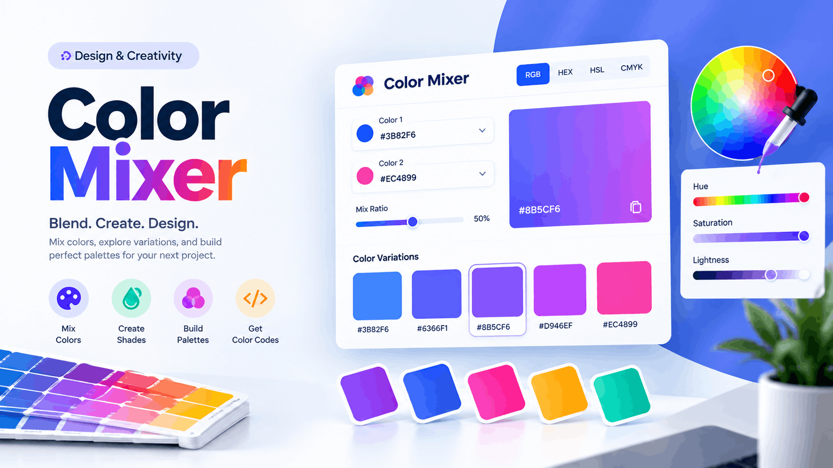
A Color Mixer is a tool or program function that allows users to combine colors to obtain a new value on a hexagon or other coordinate system. In most cases, it is possible to select two colors and adjust their ratio to produce a mixing effect.
Some 'Color Mixers' allow users to blend two colors, adjust the quantity of each, and input values in HEX, RGB, or HSL formats. For instance, mixing blue and yellow in equal proportions yields green at the point where they combine. However, the final color depends on the 'color space,' lightness, saturation, and other characteristics.
A Color Mixer can be used to:
- Blend colors that match to create new colors.
- Create lighter and darker variations of existing colors.
- Change lightness, saturation, and other color properties.
- Convert the values to different models (e.g., HEX to RGB).
- Create colors for UI elements or brand materials.
- Build color schemes or palettes.
- Preview the colors before applying changes. A professional tool helps to build a coherent system of colors.
- Test the combinations and their visual appearance. A Color Mixer is valuable for designers, programmers, and all who works with the color.
How Does Computer Color Mixing Work?
Computer color mixing is based on color models that describe the way colors are the combination of pixels on a monitor or other device. An example is the RGB model that describes colors with a combination of red, green, and blue light intensities.
The HSL model describes colors with three components: hue, saturation, and lightness. HEX is a way of encoding numerical values in RGB format, such as #3366FF.
Two colors in RGB are combined by selecting the resulting intensity of the red, green, and blue channels. The resulting color depends on the algorithm, which is not necessarily reflective of the behavior of physical paint.
RGB, HEX, HSL, and Other Color Formats
The table below provides some popular color formats and their characteristics.
| Color format | Description | Common applications |
|---|---|---|
| RGB | Red, green, and blue light intensities | Screens monitors |
| HEX | Hexadecimal representation of RGB | Web design |
| HSL | Hue, saturation, and lightness values | Color adjustment |
| CMYK | Cyan, magenta, yellow, and black | Printmaking |
| OKLab | Perceptual color space | Advanced graphics |
| OKLCH | Perceptual color space | Advanced graphics |
For website development, designers traditionally work with HEX and RGB color codes. These standards are simple and intuitive for use in HTML and CSS. Meanwhile, the HSL format is useful when a designer must make fine adjustments to the hue, saturation, or lightness of a particular color.
Modern CSS specification defines many other color formats, including those describing a perceptual color space. Color mixing can affect the display of gradients, color transitions, and animations in a browser. The choice of the particular color space is critical when the project's technologies are close to the border of innovation and must exploit modern browsers' capabilities.
How to Mix Two Colors?
To mix two colors, a designer should take two color values and combine them in a particular ratio. For example, to mix colors in a web project, one should take a blue and an orange color value, blend them, and view the resulting color.
Then, it is necessary to analyze the resulting color and determine whether it is acceptable for the current use case. The most critical aspects of mixed color are:
- Hue: to check if the resulting color belongs to the desired color group;
- Lightness: to ensure that the resulting color is not too light or dark;
- Saturation: to avoid oversaturated or desaturated colors;
- Contrast: to ensure that text or UI elements are readable;
- Task: to satisfy the requirements related to the use case (e.g., background or foreground)
Therefore, the mixed color must meet the requirements and expectations of the designer and the end-users.
Color Mixer: Create Shades, Tints, and Tones
Creating a professional palette usually involves shades, tints, and tones. Each of these variations has specific characteristics that can highlight particular elements and create visual hierarchy.
A shade is a color with black added to it making it darker, while a tint is a lighter color with white added to it. A tone is a color with gray added to it, which decreases the saturation. This way, the designer obtains a series of variations that can be utilized in a website or other material:
- Lightest: the background of the website or element;
- Light: for cards and elements highlighted by the background;
- Base: the main color to mark one of the elements;
- Dark: to highlight important actions (buttons), headers, and other elements;
- Darker: to mark hover state, text, and other elements;
- Gray: to create secondary elements, neutral backgrounds, and other objects;
The described palette creates a system in which one color controls the interface, and similar colors can serve different purposes and coexist side by side.
Color Mixing for Website Design
When designing a website, a designer usually has to choose a series of colors that will create a harmonious design. Most often, one color is selected as the main color, and two or more colors are used as its variations. For example, blue will be used as the primary color for buttons and other elements, while lighter and darker shades of blue control the background and UI components.
A professional website usually has a system of colors that may include tens of variations that follow a particular rule. It is necessary to define the colors associated with the task and create their variations using a Color Mixer:
- Primary and secondary colors;
- Accent color;
- Background and surface colors;
- Text, heading, and other colors;
- Border colors;
- Success, error, warning, and other colors;
- Hover, active, and other states;
- Focus state for interactive elements;
- Colors for cards, banners, call-to-action blocks, forms, and icons;
- Colors for lists, tables, and other objects;
The described approach allows the designer to control the website's color system instead of experimenting with colors and randomly selecting color values.
Color Mixer for WordPress and Elementor
When working with WordPress and Elementor, global colors are critical to create consistency or customize the appearance of multiple elements. This task is simplified if the designer chooses a series of associated colors and utilizes the global color system.
Using the global colors option, one can define the primary color, secondary color, accent color, header button color, link color, product card and button color, contact form color, icon color, and other attributes. In this way, a global change of one color will automatically update all objects on the website, which is impossible when working with the default WordPress system.
The use of global colors is also beneficial for brand materials, such as advertisements, social media posts, presentations, WooCommerce product cards, and marketing materials. If the brand color changes, it will be much easier to update all the materials using the global color system.
Color Mixer for Branding and Logo
Working with brand materials implies that a designer must use color variants extensively. One color is selected as the primary color, and other options are created using a Color Mixer. These variations can be used to customize the website, print materials such as business cards, and create advertising.
However, it is critical to document the primary and secondary colors fully when selecting colors for a brand. Particular attention should be paid to the following aspects:
- Name of the color variation;
- HEX value (for digital products);
- RGB value (for digital products);
- HSL value (optional);
- CMYK value (if applicable, for the print);
- Usage rules (for digital products);
- Combination with other colors (light background or dark background);
- Light and dark variations;
- Notes;
This information is helpful to ensure that the colors can support the project and appear consistent across different platforms.
Why Different Mixers May Have Different Results?
This is one of the most common questions when working with colors. Two mixers may have different results when the user mixes the same pair of two colors. This outcome occurs because of two reasons: sRGB interpolation and perceptual color space.
Modern color specification documents describe two particular color space interpolation methods, and these differences are significant. This outcome is caused by the fact that each mixer has specific mathematical tools to interpolate colors. The two options mentioned above will produce different results when the user selects red and blue and tries to mix them.
A color mixing tool works with color values, and the result depends not only on the input colors but also on the selected options. A designer should understand how the selected tool works and what result to expect.
Color Harmony: Creating Better Color Combinations
A designer should not rely solely on Color Mixer to create color combinations. After obtaining the mixed color, the designer should also consider the principles of color theory. The most common combinations include:
Complementary
Complementary color combinations are formed by two colors opposite each other on the color wheel. This option is valuable to create high contrast and use colors in the interface to attract attention.
Analogous
Analogous combinations are formed by three colors next to each other on the color wheel. Such combinations are harmonious and are useful when a designer needs to create a gentle color transition.
Triadic
Triadic combinations are created by three colors spaced 120 degrees apart on the color wheel. This option is one of the most balanced combinations and is a great choice for a website or social media.
Monochromatic
Monochromatic combinations utilize only one color and are useful to create color variations. This option is ideal for most website interfaces because it is easier to create a harmonious design using one color and its variations.
Color Mixer and Accessibility
Using an attractive color combination, designer may forget about the basic accessibility principles and degrade the user experience. It is critical to always test the text and background colors to ensure that the text is sufficiently readable.
The same accessibility criteria can be applied to buttons, icons, cards, and other objects. Text contrast tools are helpful to evaluate the contrast ratio of text and background color according to the WCAG standard.
The success criterion is based on a ratio between the luminance of the text and background colors. A ratio of at least 4.5:1 should be met for normal size text and 3:1 for larger text. Wherever possible, avoid using color to convey information, such as error messages or inactive states. It is advisable to add additional cues, such as text or icons, to ensure that all users receive the same information.
Color Mixer vs Color Picker vs Color Palette Generator
When working with colors, a designer can use different tools that serve different purposes. The main options include the following:
| Tool | Description | Best for |
|---|---|---|
| Color Mixer | Combines colors to obtain a new color or variation | Creating variations of a color |
| Color Picker | Gets color values from images or other sources | Sampling colors |
| Palette Generator | Creates a group of colors that are combined harmoniously | Designing color palettes |
| Contrast Checker | Measures the color contrast ratio between two colors | Ensuring readability and accessibility |
| Color Converter | Converts between different color notations | Preprocessing colors for code or printing |
| Contrast Checker | Tests the readability of light and dark text on a background | Validating colors for accessibility compliance |
These tools can be used simultaneously when a designer wants to create a palette. The process can start with the Color Picker, then continue with the Color Mixer to obtain several related colors, and finish with the Palette Generator to organize the result.
Common Color Mixing Mistakes
A designer can commit several common mistakes when mixing colors for a project. Avoid the following issues when you work with a Color Mixer:
- Only consider attractive colors;
- Do not pay enough attention to contrast;
- Use too many bright colors;
- Do not use a Color Mixer to create color variations;
- Create variations of colors with the same purpose;
- Forget about the hover state, focus state, or disabled state;
- Do not change the colors for print;
- Document colors improperly;
- Use the same background color;
- Rely solely on color when conveying information;
Color mixing can be a precise science if the designer follows the proper procedures and analyzes the results.
A Professional Color Mixing Workflow
To design a palette for a website or other project, use this professional workflow:
- Determine the purpose and audience of the project.
- Select the primary color.
- Select one or two secondary colors.
- Use a Color Mixer to blend existing colors to obtain new ones.
- Group colors according to their purpose instead of visual appearance.
- Note the HEX and RGB values of all colors for websites or other digital products.
- Convert to CMYK if the printer needs these values.
- Check the text and background colors for accessibility.
- Apply colors to the actual objects to assess how the project looks.
- Refine the palette and ensure that there are no issues in the final version.
The described steps will allow the designer to create a proper color system where each color has its purpose and attracts attention without unnecessary visual clutter.
How to Choose a Professional Color Mixer
The right tool should offer more than beautiful color swatches. Look for such features:
- HEX and RGB input,
- HSL or other adjustment tools,
- multiple mixing options,
- accurate color values,
- easy copy of values,
- generation of shades and tints,
- palette organization,
- contrast testing/accessibility mode,
- and information about the color model.
Modern color spaces may also be worth considering for complex projects. For a quick start, you can use this online Color Mixer to blend colors and create palettes directly in your browser.
Frequently Asked Questions
What is a color mixer?
A color mixer blends or combines colors to create new colors and color variations. It is used for websites, branding, UI/UX design, graphics, and other purposes.
Can I mix HEX colors?
Yes, because HEX codes represent RGB values, which can be processed digitally. The result depends on the specific algorithm and color space used.
What is the difference between mixing digital colors and mixing paint?
Paint contains pigments, whereas digital color is based on light. In other words, subtractive and additive methods are used, each involving different algorithms. Generally, they are not directly compatible, meaning the results may differ.
Which color format is best for websites?
HEX and RGB are standard for the web, though HSL is also suitable for adjusting colors. CSS color spaces and other variations are also being developed for modern projects.
Can color mixing improve website design?
Yes, the effective use of shades and colors can help group elements, highlight key sections, and create contrast. However, it is important to remember that color is just one aspect of design; other factors—such as layout and sizing—also play a crucial role.
How many colors should a professional website have?
There is no single standard answer. The most important thing is to create a system where the meaning and role of each shade are clearly defined. A large palette with randomly mixed colors is generally more complex to manage than a smaller one.
Can a color mixer be used for e-commerce?
Yes, such tools can be used to create a color scheme for an online store. For example, colors can be coordinated for product cards, buttons, sales tags, headers, the checkout area, notifications, and other elements.
Conclusion
A Color Mixer can be much more than just an instrument for mixing two colors. By using such tools, one can create a uniform system in which shades are related, grouped, and combined. This will allow you to set up great buttons, cards, headers, and other UI elements. A particular focus should be made on color variations for light and dark modes.
The most important thing is to remember that different color spaces have different algorithms for processing and blending colors. Therefore, one should not only be aware of the final result but also of the technology and model of the mixer itself. For websites, the best solution is to use a system in which one clearly defines the purpose of colors, groups, and variations. After that, it is necessary to choose the tools for working with the selected model and apply the colors to specific elements, following their distribution rules.
Ready to put these ideas into practice? Try the Color Mixer to blend colors, generate shades and tints, and build a consistent palette for your next project.