Color Library Guide for Designers & Developers
Color Library: A Comprehensive Guide to Organizing, Managing, and Utilizing Colors Effectively
A Color Library provides designers and developers with a structured approach to managing, organizing, reusing, and maintaining colors within a project. Instead of selecting each color individually, you can create a predefined color palette that includes the names and technical values of the colors. This simple system can help make your project more consistent, efficient, and accurate.
A collection of similar samples simply refers to a collection of similar examples. In contrast, a useful library provides the foundation for a complete visual system. Whether you're designing a website, e-commerce store, mobile app, brand identity, or marketing campaign, a consistent visual language can be applied to all elements, including buttons, logos, backgrounds, icons, forms, and banners.
However, the key to success lies in consistency. When the names of colors, roles, and core values are consistent, designers and developers can work from a single source. This ensures a more cohesive and professional look for your website.
What Is a Color Library?
A color library is a collection of colors that an individual or team can repeatedly use during a design project.
The following information can be included for each color:
- Name of the color
- HEX value
- RGB value
- HSL value
- CMYK value
- Color swatch
- The intended use
- Accessibility status
- Light and dark shades (variations)
- Category: Brand or Design System
For example, instead of simply stating a color as "blue," the design team could protect it as "Brand Blue" and maintain records of its HEX value, RGB value, and usage context.
Why is this important? Because you can't simply copy a color based on its name alone.
Why Is a Color Library Important?
If the colors are not pre-defined, developers choose them on the fly. One button might have a specific shade of blue, while another has a different shade. A developer might choose a particular shade because you haven't provided a documented value for it.
These small differences accumulate over time.
A well-organized library provides a definitive list of approved colors, which can help you:
- Maintain consistent brand identity
- Reduce the time required for the design process
- Find the perfect color quickly
- Share the values agreed upon by the team members
- Improve the consistency of the website
- Design reusable components
- Make the future of design easier
- Reduce the intensity of different color variations
- Support the implementation of the system
- Integrate design and development workflows
Therefore, particularly with large projects, the library becomes even more important.
Color Palette vs. Color Library
The terms may look alike, but they are actually quite different.
A palette is typically used to define a set of colors chosen for a specific design or brand. A color library can include one or more palettes, different variations of colors, functional colors, and reusable design tokens.
| Feature | Color Palette | Color Library |
|---|---|---|
| Main Purpose | Define a set of colors | Store and manage reusable colors |
| Scope | Generally small | Can support an entire project |
| Color Variations | Limited | Can include many variations |
| Naming System | Sometimes | Usually recommended |
| Technical Values | Often included | Strongly recommended |
| Team Usage | Useful | Very useful |
| Design System Support | Moderate | Excellent |
| Long-Term Management | Limited | Strong |
A palette explains simply: Which colors? A library explains: Which colors are appropriate, what they mean, and where we use them.
What Should Be Included in a Professional Color Library?
A well-designed system should incorporate a variety of colors, not just random ones.
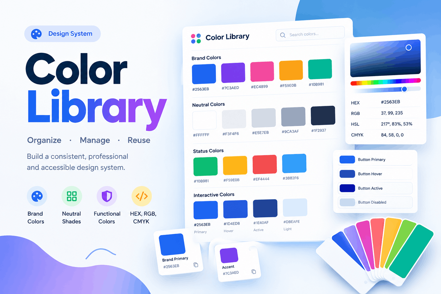
Brand Colors
These are the fundamental brand identifiers.
For example:
- Primary brand color
- Secondary brand color
- Brand accent
- Logo colors
- Supporting brand shades
These colors will remain consistent as long as you do not change the overall brand identity.
Neutral Colors
Neutral colors allow structure without overpowering the main brand colors.
Some common examples include:
- White
- Off-white
- Light gray
- Medium gray
- Dark gray
- Charcoal
- Near-black
A significant portion of the website often consists of neutral elements, such as backgrounds, cards, borders, and body copy.
Functional Colors
Functional colors communicate system states.
A library may define:
- Success
- Error
- Warning
- Information
- Disabled
- Selected
- Active
For example, a successful payment message on an e-commerce website could use a specific green color, while an error message could consistently use the same red.
Interactive Colors
Buttons and links often require multiple states.
A button might need:
- Default
- Hover
- Active
- Focus
- Disabled
Storing these values in the library results in consistent interaction throughout the entire interface.
Understanding Color Values
Technical values allow for the accurate reproduction of a specific color.
HEX
HEX is common in web development.
For example: #2563EB
Developers can directly use this in their CSS.
RGB
RGB represents the red, green, and blue channels.
Example: rgb(37, 99, 235)
This is ideal for use with digital screens and programs that support RGB color values.
HSL
HSL represents hue, saturation, and lightness.
Example: hsl(217, 83%, 53%)
If you want to create lighter or darker versions of a color palette, HSL is very useful. Because it's so simple, it's easy to learn how to lighten or darken a palette.
CMYK
CMYK stands for Cyan, Magenta, Yellow, and Black. This term is typically associated with print production.
If a brand uses the same color palette across its website and printed materials, providing print values can help ensure consistency.
How to Organize a Color Library
A well-organized library is efficient.
Example of Naming Conventions
Brand
- Brand / Primary
- Brand / Secondary
- Brand / Accent
Neutral
- Neutral / 50
- Neutral / 100
- Neutral / 500
- Neutral / 900
Status
- Success
- Warning
- Error
- Information
Interactive
- Button / Primary
- Button / Primary Hover
- Button / Primary Focus
This system is easier to understand than names like "Blue 1," "Blue 2," and "New Blue."
The color should be indicated by its meaning, not just its appearance.
Why Are Names Important?
Imagine a developer seeing ten blue color swatches labeled only as "Blue A," "Blue B," and "Blue C." They wouldn't know which color is intended for buttons, headings, background, or links. A role-based naming system solves this problem.
Weak naming:
- Blue 1
- Blue 2
- Dark Blue
- Light Blue
Better naming:
- Brand Primary
- Brand Primary Hover
- Surface
- Accent
- Text Primary
The second naming system will also remain useful if you change the original colors later.
For example, you might decide to replace the primary blue color with purple. In this case, the brand primary token would still be recognizable, while "Blue 1" would become confusing.
Color Libraries and Design Systems
When used as part of a comprehensive design system, a color library becomes even more valuable.
A design system helps to define:
- Colors
- Typography
- Spacing
- Buttons
- Cards
- Forms
- Icons
- Grid rules
- Components
- Interaction states
A design system provides a foundation for individual components.
For example, a primary button can use a "Brand Primary" token to define its primary color. The primary hover state can also be implemented using a "Brand Primary Hover" token.
This process reduces the amount of decision-making required by your team. As a result, you will be able to develop interfaces much more quickly.
Using a Color Library with Website Development
Colors help bring website projects together.
A developer can define variables such as:
:root {
  --brand-primary: #2563EB;
  --brand-dark: #1E3A8A;
  --brand-light: #DBEAFE;
  --text-primary: #111827;
  --surface: #FFFFFF;
}
Components can then reference these variables, rather than using irrelevant HEX values throughout the stylesheet.
When a brand changes, the developer can adjust the main colors instead of having to modify every page individually.
This principle applies to WordPress websites and page builders that support global color palettes or design tokens.
WordPress and Elementor Color Library
If you're working with WordPress and Elementor, a centralized color system can be particularly helpful. You can eliminate the need to manually choose colors for each heading, section, button, and card.
Alternatively, you could establish a comprehensive palette, such as:
- Primary Brand
- Secondary Brand
- Accent
- Heading Text
- Body Text
- Light Background
- Dark Background
- Border
- Success
- Warning
- Error
Future updates will be much easier. Instead of manually updating dozens of individual elements, you simply update the approved color.
Color Library for E-commerce Websites
E-commerce websites utilize a wide variety of interface elements, demanding a consistent and user-friendly experience.
A library can control colors for:
- Product titles
- Prices
- Sale prices
- Add to Cart buttons
- Checkout buttons
- Product badges
- Navigation
- Filters
- Search boxes
- Reviews
- Stock messages
- Discount labels
- Shipping information
If your website uses the same primary color for every call-to-action button, customers will quickly recognize that this is the visual cue for the primary action.
However, it is crucial not to rely solely on color — users still need to be able to read the labels.
Color Libraries and Accessibility
Don't forget the accessibility of your library. Test contrasting foreground and background colors for each important combination:
- Text Primary + Background White
- Button Text White + Primary Button
- Heading Text + Light Surface
- Link Color + Background
This process helps to avoid a situation in which your team might choose attractive colors that later cause readability issues.
It's also a good idea to note down whether a particular color is approved for large text, small text, interface components, or decorative use.
Multiple Light and Dark Variations of Colors
A complete library of colors should contain multiple variations of each primary color.
| Level | Example | Purpose |
|---|---|---|
| 50 | Very light | Background |
| 100 | Light | Soft surface |
| 300 | Medium-light | Light border or decoration |
| 500 | Main | Main color |
| 700 | Dark | Strong text or button |
| 900 | Very dark | Very dark variation |
You may find a version of this numbered system in modern design systems.
Numbering isn't vital, so long as you're consistent.
Your designers should know which values relate to which purpose: background, interactive, or strong text.
Color Library vs Random Color Selection
| Work Process | Consistency | Speed | Scalability | Maintenance |
|---|---|---|---|---|
| Random color selection | Low | Poor | Difficult | Easy |
| Simple palette | Good | Moderate | Organized | Easy |
| Color library | Excellent | Excellent | Easy | Full |
| Design system | Excellent | Excellent | Very strong | Full |
How far you go depends on the size of your project. A personal project might manage with a simple palette, but growing websites, agencies, brands, and stores will find benefit from a formal library.
Color Library Mistakes to Avoid
Don't Store Too Many Unnecessary Colors
If a color library isn't streamlined, it won't serve you well. Remove duplicate and unused colors regularly.
Name Colors According to Function
A descriptive color name will always beat a subjective one like "Beautiful Blue" or "Dark Shady Green."
Don't Rely on Appearance-Only Names
Names such as "Nice Blue" or "Darkish Green" are always a little subjective. Role-based names beat them anytime.
Always Document Technical Color Values
When the designer creates a color swatch, it appears clear, but another designer may choose an incorrect value when implementing.
Separate Brand from Temporary Colors
If you're testing a lot of swatches, keep those separate from your approved brand colors.
Don't Forget Accessibility
Even if the colors look appealing, they may not meet your contrast requirements. Make sure to check them before approval.
Limit the Number of Similar Shades If Possible
If you have five different shades of blue, each serving exactly the same purpose, consider cutting them down to a more manageable set.
Don't Create Unnecessary New Colors
You may spend all day trying to match a new shade of blue to an existing blue — when you could just keep using it.
Building a Reliable Color Library
Follow this process to start working with a professional color library:
Step 1: Pull Together Current Brand Colors
Search for logo colors, website colors, packaging colors, social media colors, and anything else with an official palette.
Step 2: Remove Duplicate Values
Search for colors that are similar or the same values, and mark only one as approved.
Step 3: Organize the Library
Distinguish between branding, neutral colors, functional interface colors, interactive elements, and decorative colors.
Step 4: Label Your Colors
Choose role-based names such as Brand Primary, Surface, Success, or Heading Text.
Step 5: Record Technical Color Values
If needed, save HEX, RGB, CMYK, and HSL values.
Step 6: Check Contrast
Be sure to test prominent foreground and background combinations before using them.
Step 7: Record Approved Uses
Write down the rules of where and when your colors should be used.
Step 8: Make the Colors Available to All
Post your color library so that designers, web developers, copywriters, and project managers can reference it as needed.
Managing a Color Library
Having a color library doesn't help if no one maintains it.
Follow these guidelines:
- Keep only the approved colors separate from experiments.
- Use clear, role-based naming for each color.
- Document its numeric value.
- Nominate a single person to be responsible for the library.
- Audit your colors regularly; remove any that you're not actively using.
- Check accessibility against your color combinations before naming a new color.
- Keep a record of how each shade should be used (and not used).
- When designing light and dark color variations, record a scale (such as 100–900) instead of a set of randomly numbered shades.
- If your project requires web and print colors, keep those values separate.
- When undertaking a major rebrand or website redesign, review your entire library.
- When selecting a new color, double-check to see if it's already being used to fulfill that same purpose.
There's no need to collect the maximum number of colors possible — fewer colors that are easy to navigate will serve you better.
Frequently Asked Questions
What Is a Color Library Used For?
A Color Library creates a systematically stored set of approved colors that a developer and designer can draw from to maintain consistency across a project.
What Should a Professional Color Library Contain?
Functional colors, interactive states, neutral colors, brand colors, rules of use, accessibility information, technical values, dark versions, and light versions.
How Is a Color Library Different from a Color Palette?
A palette is the set of colors while a library is the system with all possible colors a project or brand uses.
What Should We Call a Color?
The name is more useful in a library because the reason why you name a color is to be able to communicate to everybody the reason why you use that specific color.
Is It Useful to Store HEX and RGB Values?
Yes, for digital projects, it can be useful to store both HEX and RGB values.
Do We Need to Store CMYK as Well?
If the project is going for professional printing it could be useful, but you don't need to store CMYK values for screen or digital projects.
How Many Colors Should a Color Library Have?
There isn't a fixed amount of colors. It should be the minimum of colors that you need to keep your design system consistent.
What's the Benefit of Having a Color Library for a Website?
This can be very useful to avoid repeating work on a website and to be able to make global changes very fast. This is great for large websites and applications with many pages or elements.
Why Include Accessibility in a Color Library?
It can be very helpful to test color combinations to see if they are accessible before you have them published.
Conclusion
The main advantage of having a Color Library is that you will have a system of colors with a name and a function so you can always know exactly where to choose the color from. This system consists of a set of colors that you need, not only the ones you use, because it's easier to have a large set of predefined colors and sort them according to their role rather than having a big set of unrelated colors.
The advantage is not the number of swatches you will get — it is knowing why you are using them.