Color Chart Guide | Codes, Matching & Design Selection
Color Chart: A Practical Guide to Color Codes, Matching, Selection, and Professional Design
A Color Chart is more than just pretty swatches of color. It's a practical reference to assist you in finding shades, matching color values, creating matching palettes, and maintaining designs throughout websites, branding, print, products, and marketing materials. With proper application, it can transform a questionable color selection into a definite design decision.
For instance, a designer might fall for a specific shade of blue on a screen but want to have its HEX, RGB, and/or CMYK numbers prior to using it for professional work. If the information is recorded in a structured color reference, it's easy to reuse and record. It also ensures that teams do not have any minute discrepancies in color which could lead to the brand not being uniform.
This guide will teach you the basics of color references, the technical values of colors, choosing combinations, and using color for professional digital and print projects.
What is a Color Chart and Why is it Important?
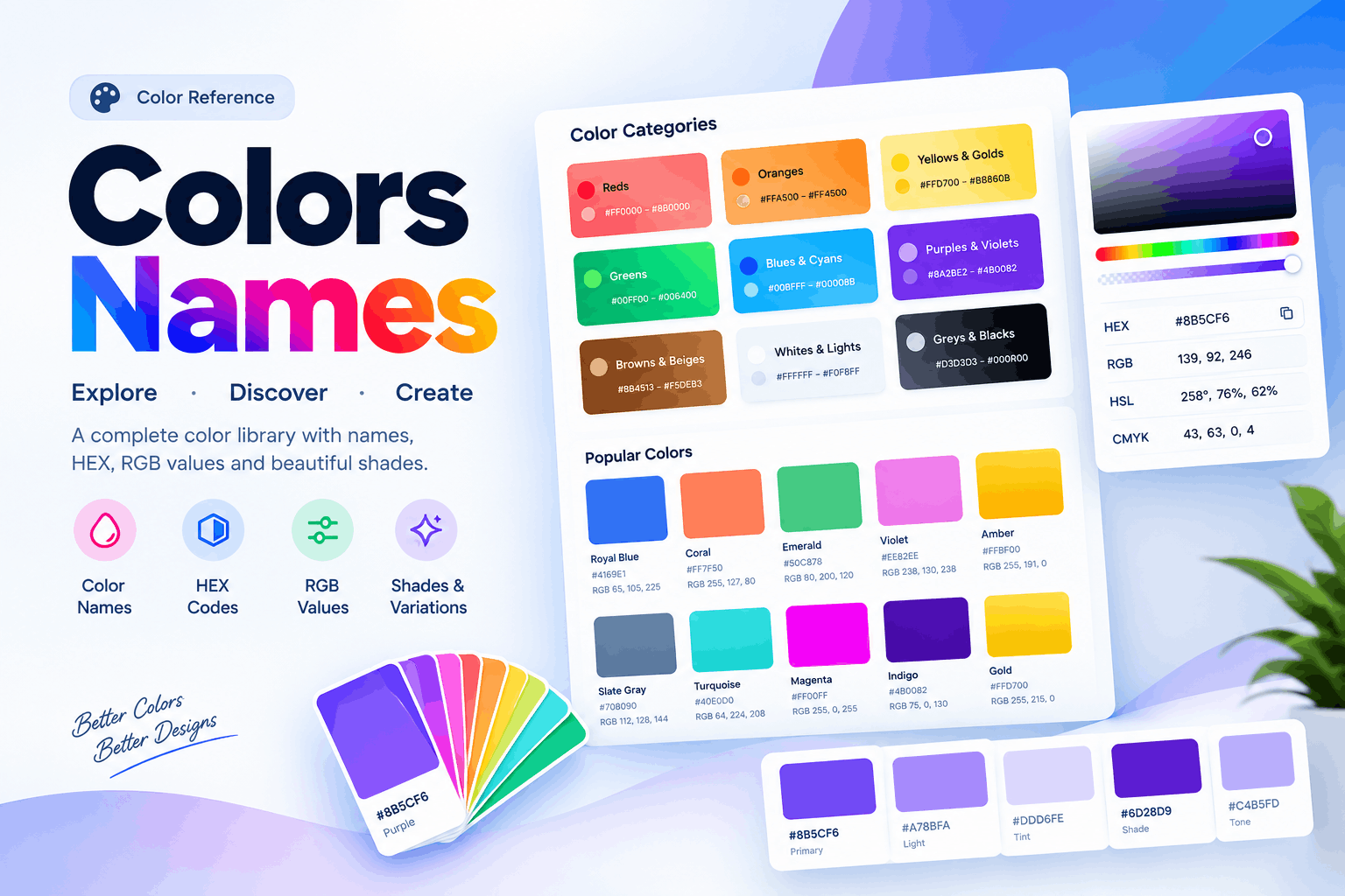
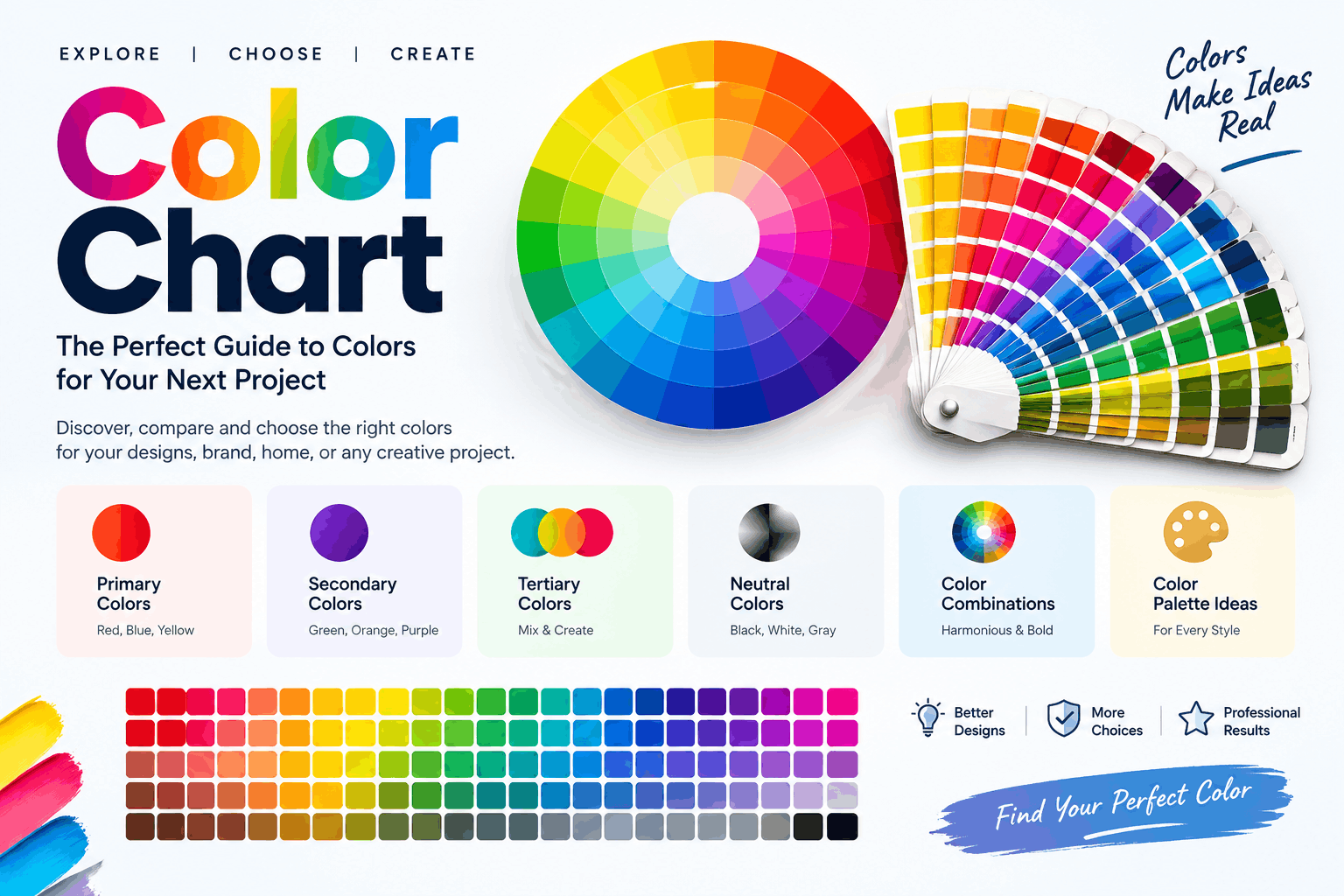
A Color Chart is a visual system that allows the user to compare colors and understand their properties. It can contain color names, swatches, HEX codes, RGB, CMYK percentages, HSL, or paint references depending on what it is being used for.
It is consistent and this is its value. Let's say a business has decided on a particular blue color to use in their logo. Customers might notice the difference even if the shades look like the same blue, even if the shades are related to one another in their hue, color, or value.
This problem can be resolved with a documented color palette.
It provides a common reference for designers and developers on:
- Brand colors
- Website backgrounds
- Buttons and calls to action
- Typography
- Product packaging
- Social media graphics
- Printed marketing materials
- UI elements
- Illustrations and presentations
As such, the chart cannot be considered as just a set of swatches and should be included as part of the design system.
Main Color Formats: What You Need to Know
One of the most useful skills is being familiar with what type of project is represented by which color format. Different technical values are used for the same visual color in different color models.
| Format | Meaning | Best Used For | Example |
|---|---|---|---|
| HEX | Digital color value of six digits | Websites and UI | #2563EB |
| RGB | Red, Green, Blue | Screens and digital graphics | 37, 99, 235 |
| CMYK | Cyan, Magenta, Yellow, and Black | Professional printing | 84, 58, 0, 8 |
| HSL | Hue, Saturation, Lightness | Design of web and interfaces | 217°, 83%, 53% |
| Pantone | Standardized spot-color system | To make brands and prints | Specific PMS reference |
HEX Colors
HEX Codes have vast usage in website development. These usually have 6 characters following the #.
For example: #2563EB
The first two characters are red, the next two green, and the last two are blue.
A plus to the HEX values is that they deliver a definite value that developers can simply input into CSS. This is why they're particularly vital for WordPress sites, landing pages, ecommerce stores, and web apps.
RGB Colors
RGB is a color system that stands for red, green, and blue. Usually 0-255 for each channel.
A computer design program could thus display: RGB(37, 99, 235)
RGB is a suitable method for light-emitting screens such as monitors, smartphones, televisions, etc.
CMYK Colors
The CMYK colors are cyan, magenta, yellow, and key/black. In commercial printing, it is known as a common use.
Bright colors that appear well on a computer screen may not be as vivid when printed out. That difference occurs because screens use light to produce color while printers use ink to produce color.
When designing, designers need to convert and test critical colors before giving the OK to a large print order.
How to Use a Color Chart Properly
It takes more than just looking at the swatches to read a professional color reference.
To begin, determine the color family. Red, orange, yellow, green, blue, purple, pink, brown, gray, black, and white are common families.
Then look at the characteristics of the shade:
- Hue: The basic color family.
- Saturation: The strength or weakness of a color.
- Lightness: How light or dark it is.
- Temperature: How warm or cool the temperature feels.
- Contrast: How different it is from a different color.
For instance, two different blue hues can be almost the same color but with almost opposite darkness and lightness. One could seem energetic and modern, the other could seem calm and professional.
The difference is important in the development of a visual identity.
Color Theory Basics for Better Combinations
Knowing a few color theory basics can help you create better color combinations.
A professional palette can't be based only on the taste of the individual. There is a good guideline that can be used to make combinations that are intentional: basic color theory.
Complementary Colors
Complementary colors are colors that are opposite on the color wheel. They make for great contrasts.
This is often the case with blue and orange. The designer could choose blue as the main brand color and add accents of orange to certain buttons or marketing components.
But when you use both colors in the same proportion in a large design, it can get very intense. A more effective color scheme would be a primary color with it as an accent.
Analogous Colors
Analogous colors are located next to each other on the color wheel. Typically, they result in a seamless and continuous visual effect.
Design palettes of blue, blue-green, and green can be effective for technology, environmental, healthcare, and lifestyle designs.
These shades are similar visually and can be helpful when a harmonious look is desired.
Monochromatic Palettes
Monochromatic colors are shades of the same base color.
A web page might employ:
- Dark blue for headings
- Medium blue for buttons
- Light blue for background colors
- Very light blue for cards
This will give a clean and controlled look. It's particularly helpful for corporate websites and minimal interfaces.
Triadic Palettes
A Triadic scheme is a palette that provides 3 colors, spaced around the color wheel. It can provide diversity and still be balanced.
It's helpful when the brand is creative, the graphics are educational, the illustrations are illustrative, or the marketing designs are marketing.
How to Select the Right Colors for a Brand
Brand color selection is not just a favorite color.
Begin with the brand's essence. What is the business looking for the customer to experience?
For example:
- Blue: Often associated with trust, stability, and professionalism.
- Red: Can communicate energy, urgency, passion, or excitement.
- Green: Often connects with nature, growth, freshness, or health.
- Purple: Can suggest creativity, luxury, or imagination.
- Orange: Often feels energetic, friendly, and approachable.
- Black: Can create a premium, elegant, or powerful appearance.
- Yellow: Can communicate optimism and attention.
These associations are not universal rules. Culture, industry, context, saturation, and surrounding colors can change how people interpret a shade.
Therefore, color psychology should guide the decision rather than dictate it.
How to Create a Professional Brand Palette
You don't need dozens of colors for a strong brand. Rather, establish a structured system that has roles assigned.
A working palette might include:
- Primary color — the main brand identifier.
- Secondary color — accentuates the main color.
- Accent color — highlights important actions.
- Neutral color — helps backgrounds and layouts.
- Text color — offers easy readability.
- Functional colors — communicate success, warnings, or errors.
For instance, an ecommerce website could use a dark navy or blue primary color, a bright accent for purchase buttons, soft gray backgrounds, and a dark neutral for body text.
It doesn't matter the actual colors. What is important is that each color has a consistent role.
How to Use Color Charts for Website Design
It is possible for a web designer to utilize a color reference on the complete interface.
The following are a few items that should be addressed in a website palette:
- Header and navigation
- Hero section
- Buttons
- Links
- Product cards
- Forms
- Footer
- Background sections
- Icons
- Alerts
- Hover states
It's especially helpful when recording exact HEX values for WordPress and Elementor websites. After all the colors are determined, global colors can be used across the website, rather than having to choose a slightly different shade for each part.
This will save time and will be more consistent.
Example Website Color System
Think of a web shop that is blue.
A simple system can be defined as:
- Primary: #2563EB
- Dark: #1E3A8A
- Light: #DBEAFE
- Accent: #F59E0B
- Text: #111827
- Background: #F8FAFC
Each value can then be given a role by the designer. This means a repeatable system rather than a random selection of color.
Color Accessibility and Contrast
Readability is another factor that should be taken into account when choosing colors.
Outwardly appealing combinations can make for a bad user experience when text fades into the background. This is particularly significant for small text, forms, navigation links, and important instructions.
For instance, light gray text on a white background can be hard to read.
A better process checks:
- Text-to-background contrast
- Button readability
- Link visibility
- Form labels
- Error messages
- Focus indicators
- Dark-mode versions
Also, do not convey important information using color only. Don't just use yellow or red to alert the user of a warning.
Digital Colors vs Printed Colors
One of the most frequent errors is expecting a screen and a printer to match colors 100% of the time.
Digital devices are based on color systems like RGB. Printing is based on ink-based systems like CMYK.
This means that a bright RGB color could appear duller in print.
Print a proof of an important project and read it in appropriate lighting. For branded materials, professional color management will also help to maintain consistency.
The Color Chart vs Color Picker vs Color Wheel Dilemma
There are different tools for different purposes.
| Tool | Main Function | Best For |
|---|---|---|
| Color Chart | Compare and record colors | Selection and reference |
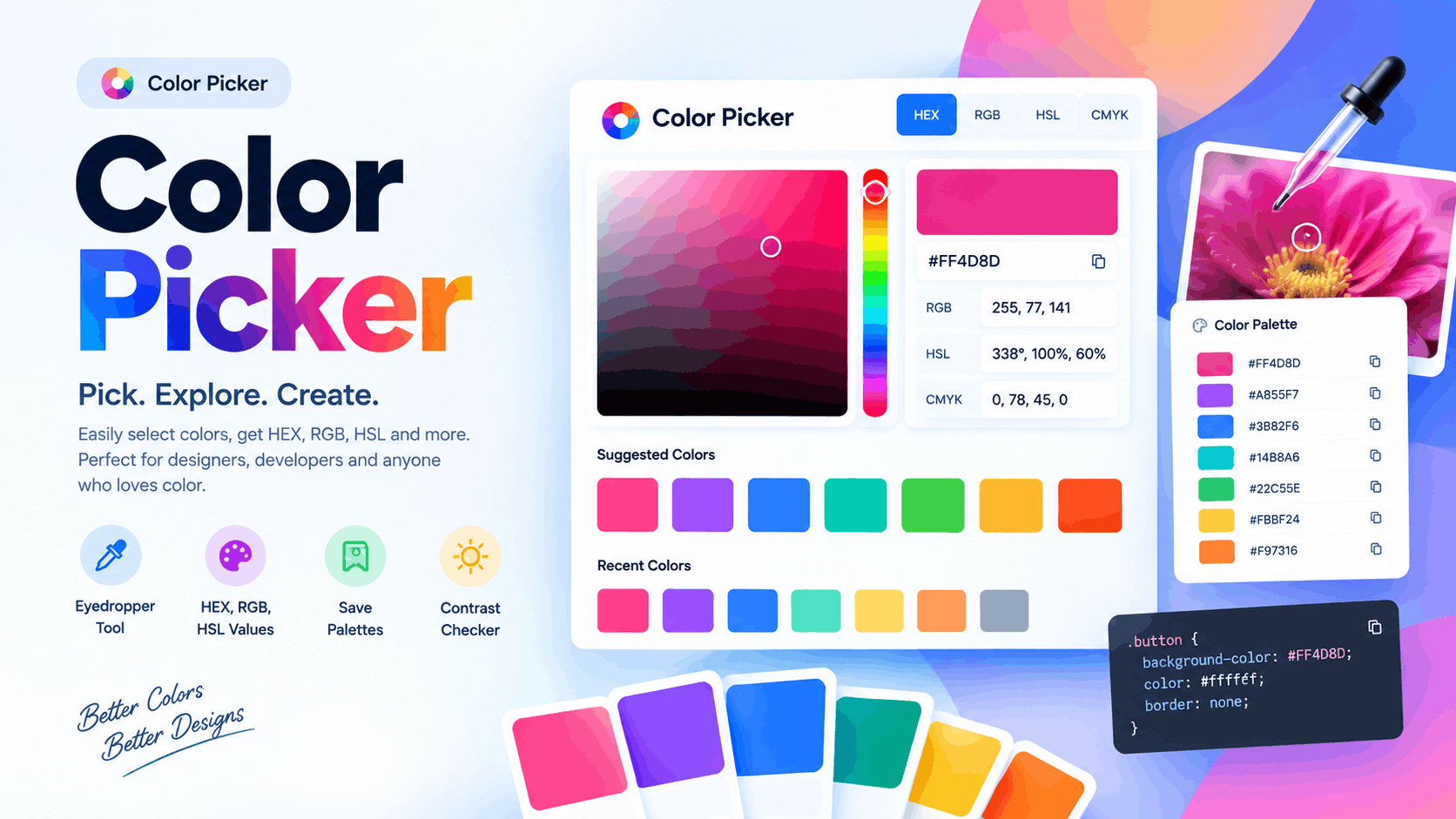
| Color Picker | Capture a particular color | Extracting colors from images |
| Color Wheel | Understand color relationships | Palette creation |
| Palette Generator | Create combinations | Fast design exploration |
| Contrast Checker | Test readability | Accessibility |
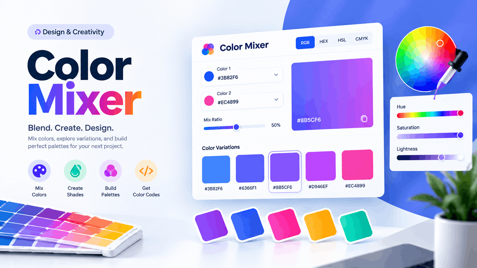
All 5 can be employed within a single project by a designer. For instance, the color picker tool can take a color from a photo, the color wheel can recommend complementary colors, and the contrast checker tool will check the readability of text.
Common Color Mistakes to Avoid
Even seasoned designers can make bad color choices if they don't test.
Using Too Many Colors
Too many colors in a design may result in loss of visual hierarchy. Take a few colors, add more if necessary.
Ignoring Contrast
The beauty of a palette is ruined if users can't read the information.
Selecting Colors Without Context
What might be a good color for a children's brand may not be a good color for a legal firm. Always keep your audience and industry in mind.
Creating a Design on a Single Screen
Brightness and calibration can alter the color appearance. Test significant work on multiple devices.
Forgetting Print Requirements
If it is going to be printed, take into account the printing process from the outset if it will be used on packaging, signage, business cards, or brochures.
Changing Brand Values
The use of slightly different versions of the same brand color reduces consistency. Use an approved reference and make sure that the same values are used.
A Workflow for Professional Color Selection
A repeatable workflow can help to make color decisions quickly and accurately.
Step 1: Establish the goal.
Determine the content of the design.
Step 2: Do some research on the audience.
Take into account the expectations of customers, industry standards, and cultural context.
Step 3: Choose a base color.
Select the dominant color which complements the brand message.
Step 4: Create background colors.
Make use of color theory for complementary, analogous, or monochromatic choices.
Step 5: Identify technical values.
Record HEX, RGB, CMYK, or other required values.
Step 6: Check accessibility.
Test text, buttons, links, and interactive elements.
Step 7: Test the palette.
Look it through on various screens and, if needed, print proof.
Step 8: Record the completed system.
Put together a reference to follow by designers, developers, marketers, and printers.
This workflow saves a lot of guesswork and will ease future updates.
Frequently Asked Questions
What does a Color Chart do?
A Color Chart is used to label, compare, sort, and record the color. It can be used to create website design, branding, printing, painting, product development, and marketing.
What is the best color scheme for a website?
Commonly used for websites, RGB and HSL are also useful for digital design. The format of the best results will depend on your development process.
What is the difference between HEX and RGB?
The digital color can be the same but is rendered differently by HEX and RGB. HEX gives the numbers as hexadecimal whereas RGB gives the numbers as red, green, blue.
Why is my print of color not the same?
Colors are being generated on a screen, and colors are being printed onto paper or other mediums using ink. The final result may differ due to the difference between RGB and CMYK, paper type, ink, printer settings, and lighting.
How many colors are there in a brand palette?
There is no set guideline. A tight color palette with a few well-defined primary, secondary, accent, neutral, and functional colors can offer sufficient variation without overwhelming the viewer.
Which of the following color sets is best?
No single optimum combination. The type of palette will vary depending on the brand, the audience, the industry, the purpose, the contrast needs, and the platform. These systems can be used as a starting point: complementary, analogous, monochromatic, and triadic system.
How do I ensure that my website colors match?
Using precise color values and assigning each one a particular function. Global colors then come in handy for applying the same colors to headings, buttons, backgrounds, links, etc. on the website builder like Elementor.
Final Conclusion
A Color Chart is really helpful when it relates visual to technical accuracy and a clear design purpose. Designers can build a reliable color system by choosing colors based on relationships, HEX and RGB values, print requirements, accessibility requirements, and/or brand guidelines instead of picking colors at random.
But the best comes when color is used as part of the user experience. The first rule of a palette is that it should make it easy to read, convey the appropriate message, reinforce brand identity, and be consistent in all channels.
A well-documented color reference may save time and ensure the final product is of high quality when creating a website, building an ecommerce store, establishing a brand identity, preparing printed marketing materials, or designing graphics for social media.
To sum up, effective color selection isn't that of the most appealing color. It's all about knowing and using the right color in the right place, all the time.